Gallerian
Gallerian | Art Delivery | UX & Branding
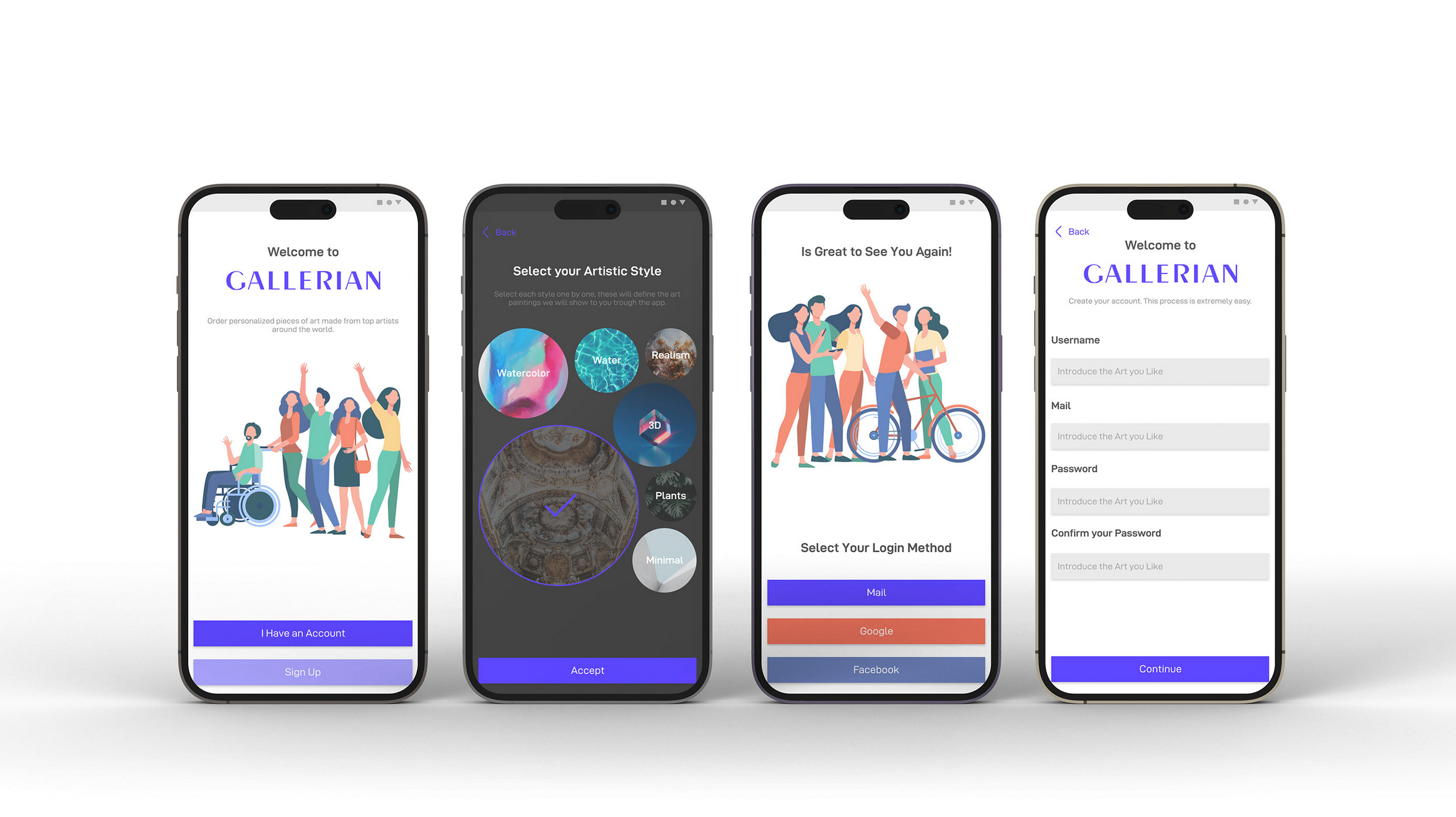
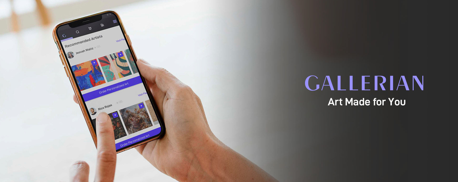
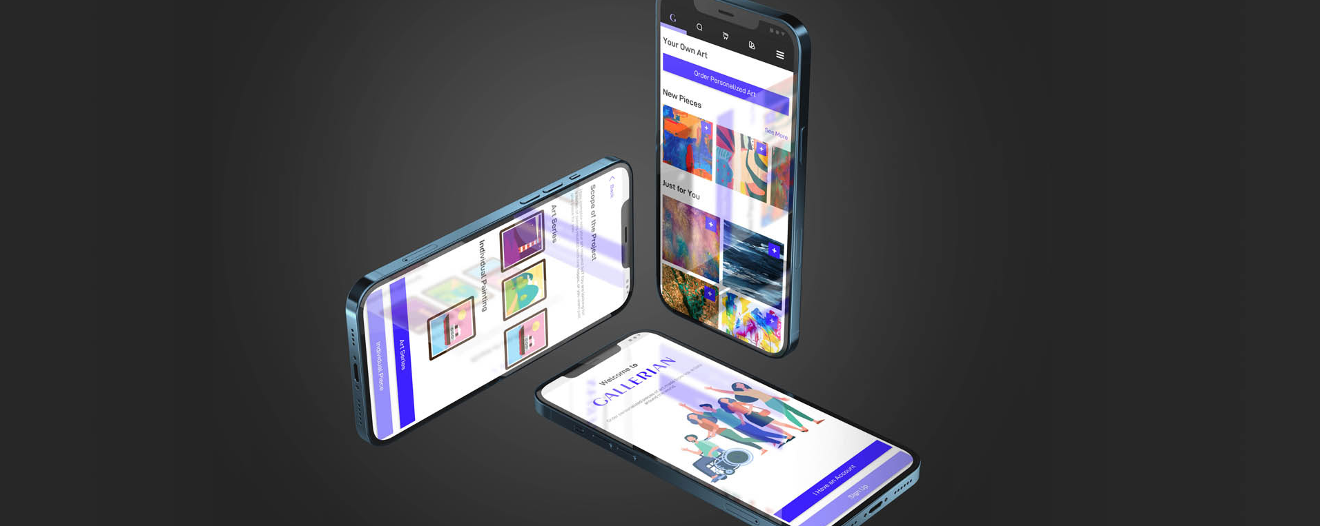
Gallerian is an app meant to help art lovers to order personalized pieces of art from talented artists, this in order to plasm their unique style the best possible way.
The goal was to create an app that help users to order personalized paintings ready to hang easily.
Project Duration
Approximately 2 months.
The Problem
People cannot find art pieces that represent their style.
My Role
Lead UX designer, UX researcher.
Responsibilities
Branding, User Research, Defining, Ideation, Wireframes Design, Prototyping, Usability Studies.
User Research Summary
I’ve conducted primary research at the beginning of the project. I interviewed 6 persons who are art lovers and have a big interest in collectionism. They gave me some key insights, which I will present in the next slide.
Pain Ponts
1. Art selling platforms use to be impersonal and quite pushy (selly).
2. There are a ton of copies in the market.
3. There is no way to connect with artist inside the platforms.
4. They cannot find their style in these art selling platforms.
User Persona – Dinora
Problem Statement
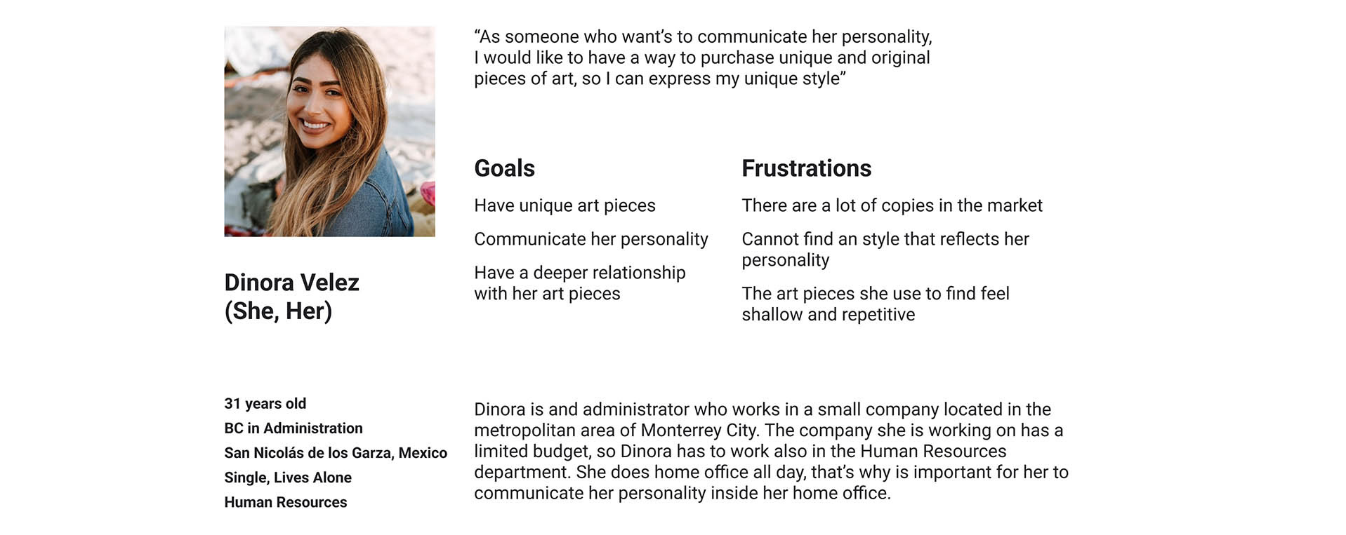
Dinora is a home office worker who needs a way to purchase original paintings, this in order to express her style inside her personal office.
User Persona – Salem
Problem Statement
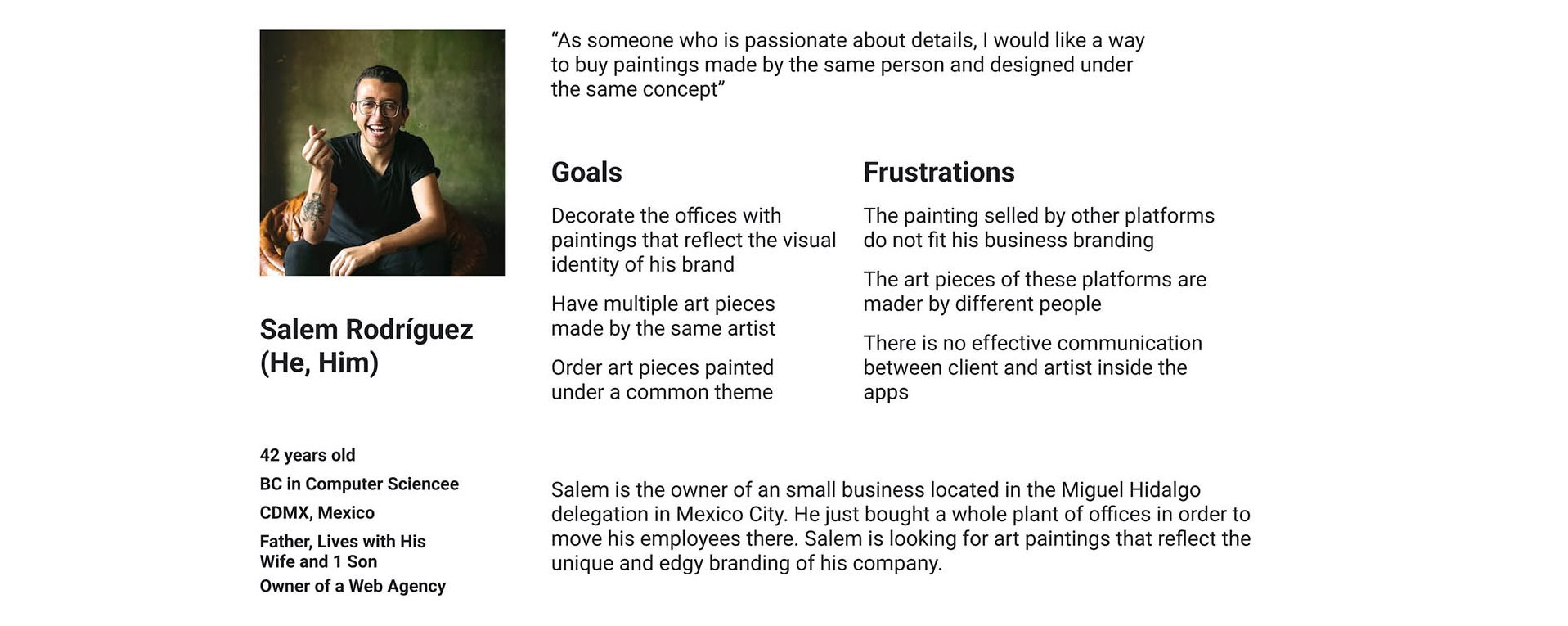
Salem is a business owner who needs a way to order a group of personalized paintings made by the same author and under a common theme, this in order to reflect his business brand.
User Journey
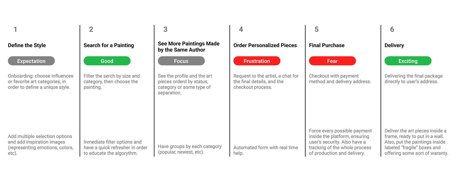
The goals were highly connected with the user’s approach to purchasing pieces of art online. And this premise was the base of the User Journey Map.
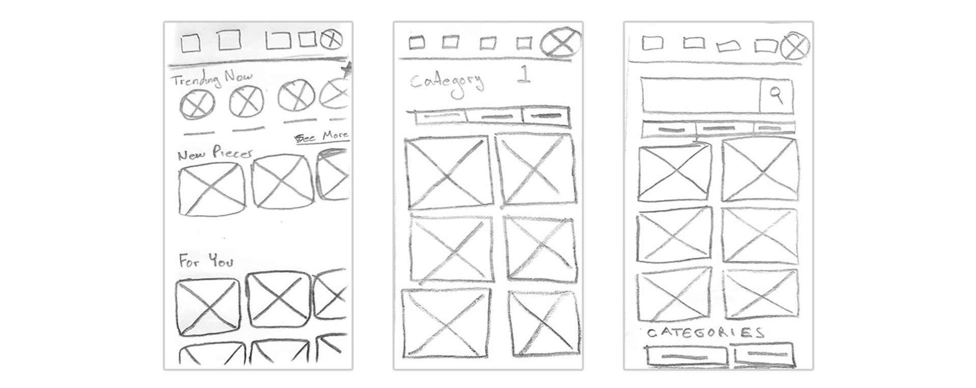
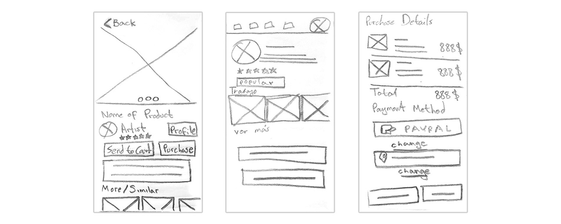
Paper Wireframes
The goal of the initial wireframes was to design an effective and easy to use experience, taking in account every possible scenario or edge case. Obviously, this created with the user as the protagonist.
Digital Wireframes
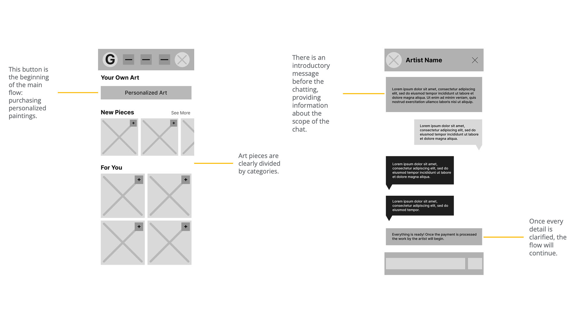
After the initial usability study, I directed the whole app to the purchasing personalized art process.
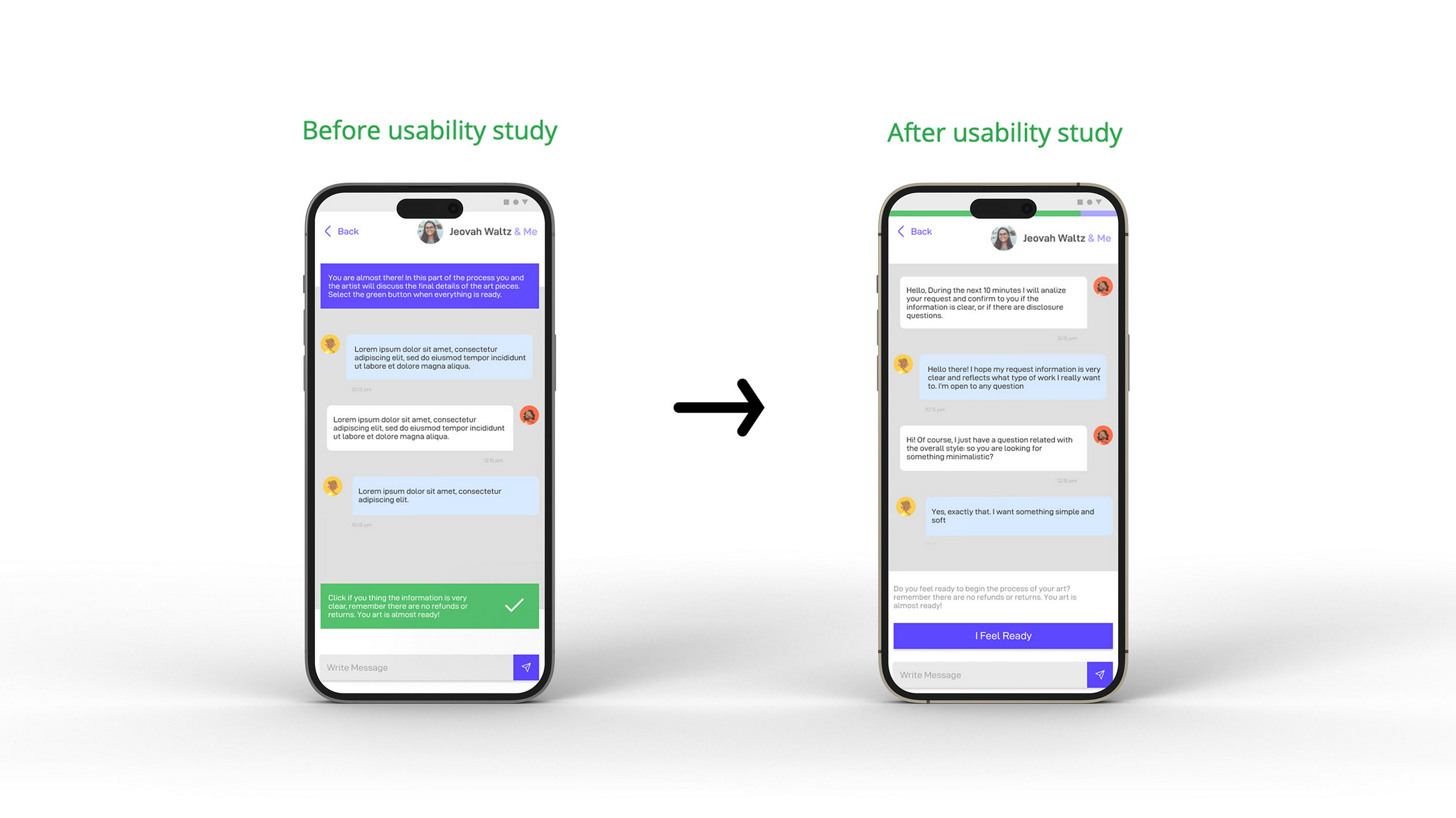
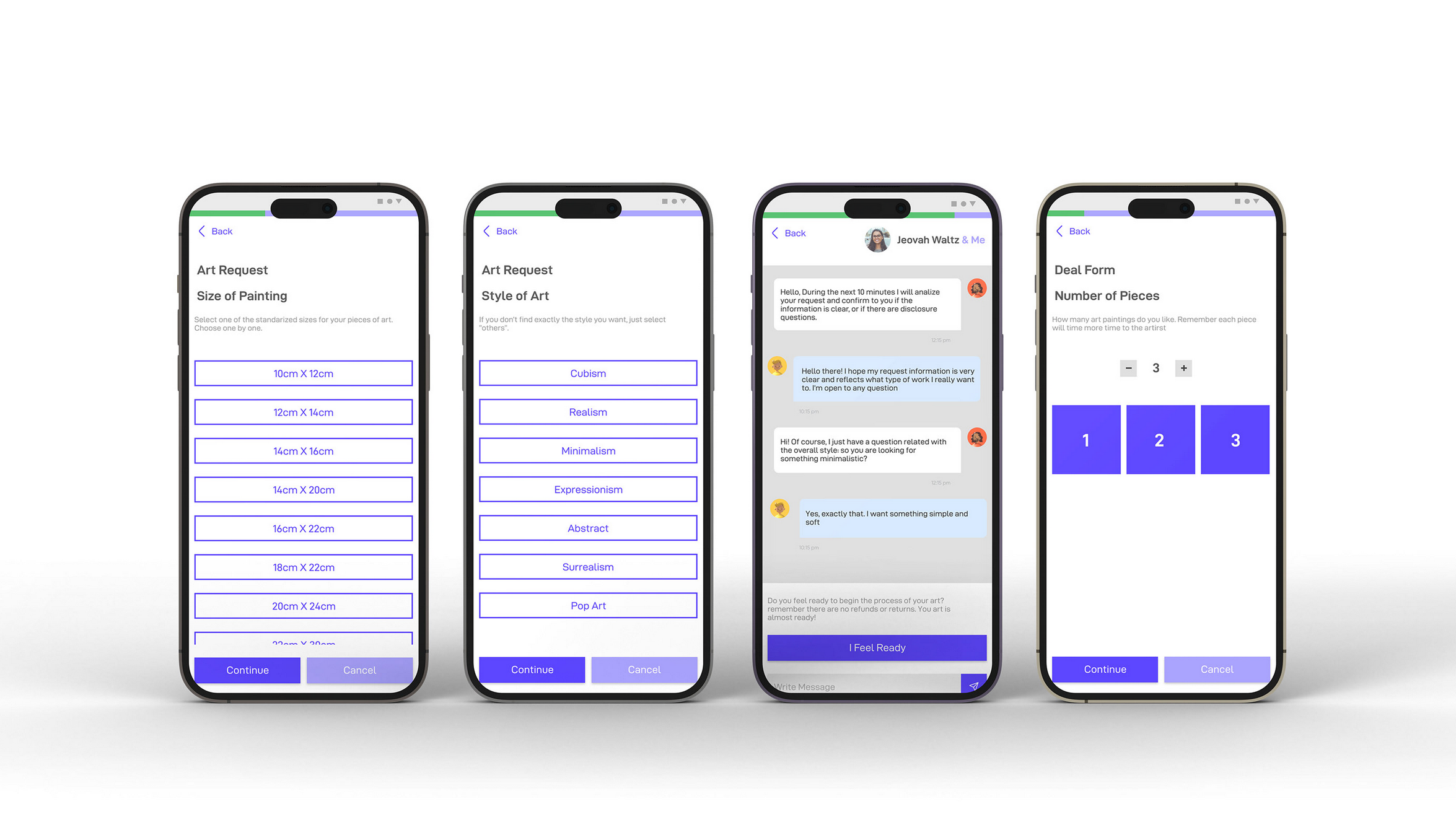
The user-artist chat is a very important and sensitive part of the app; this can be the difference between a delightful experience or an awful one.
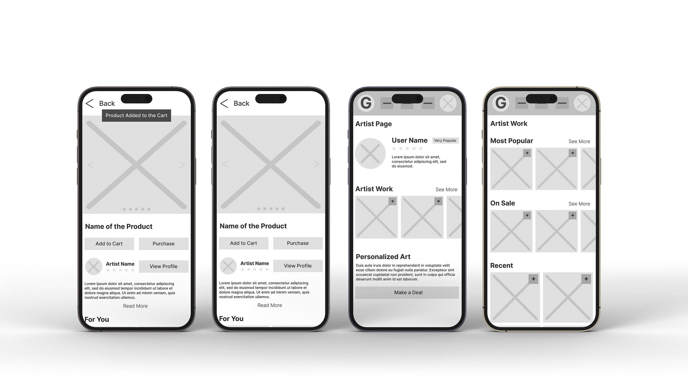
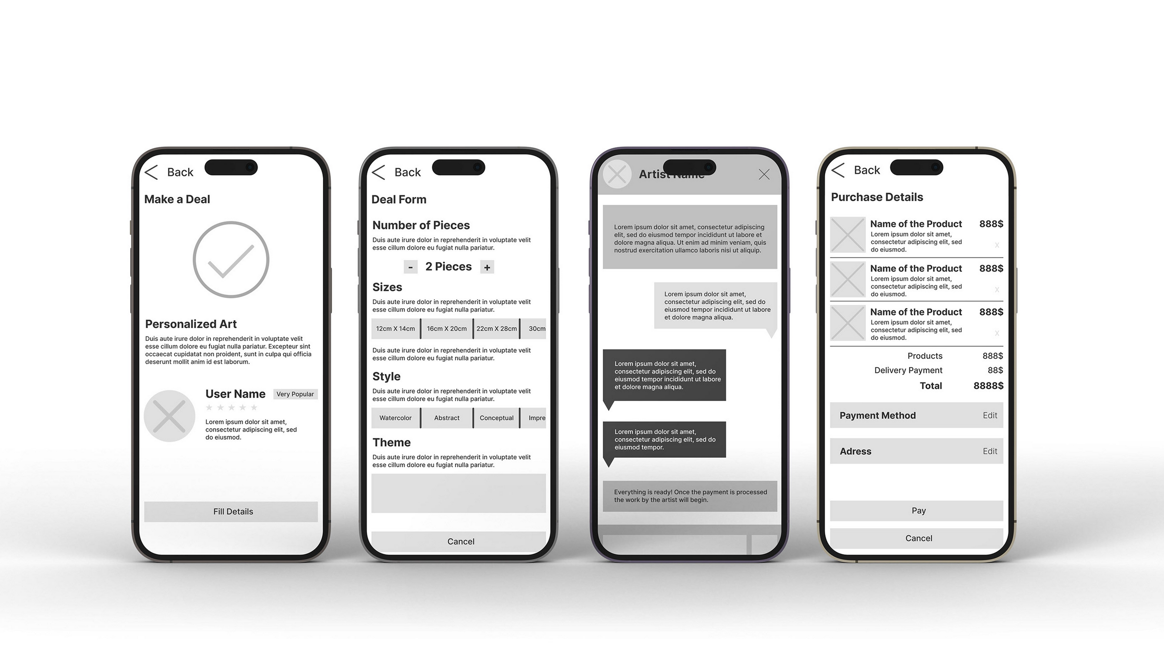
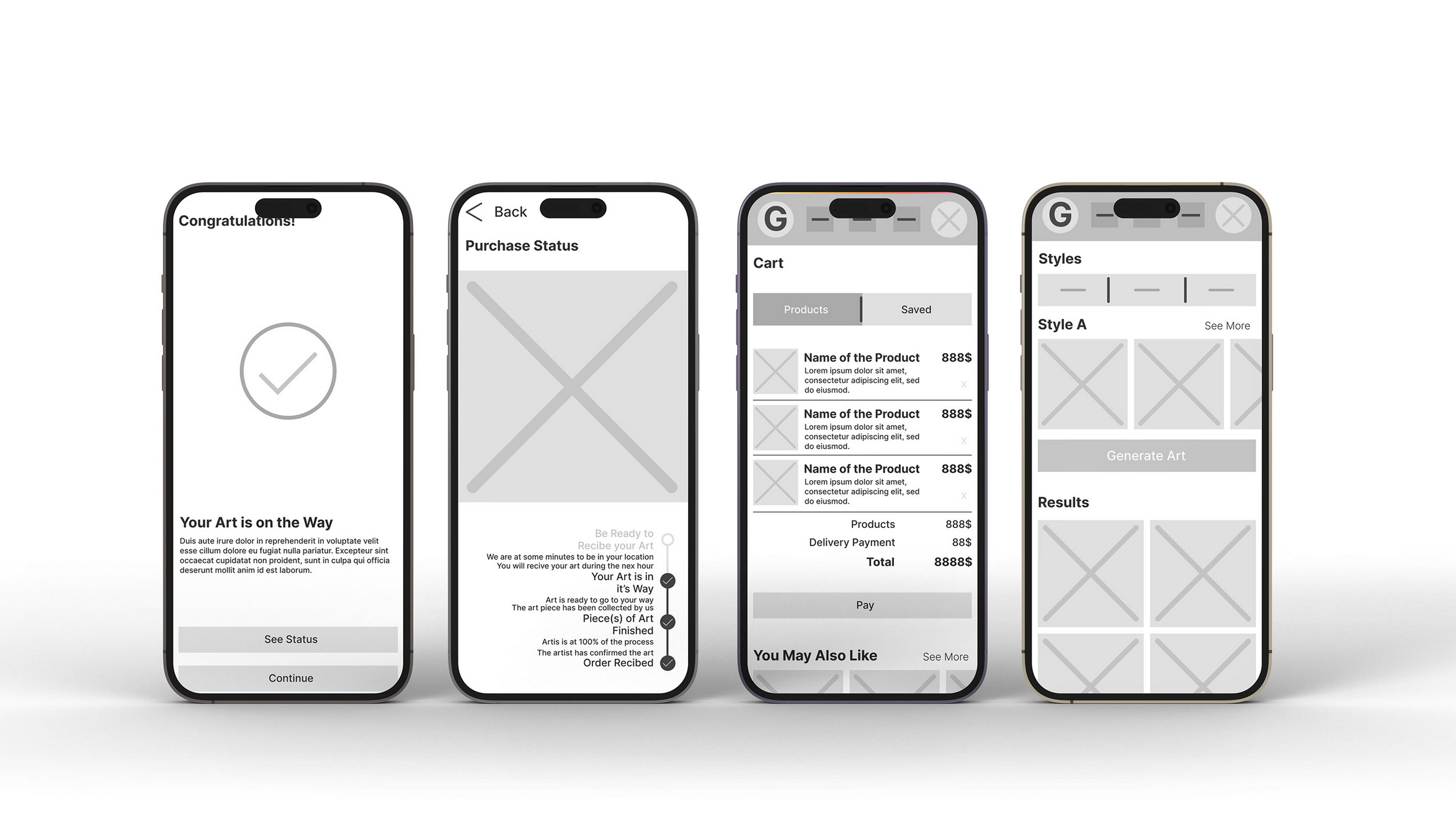
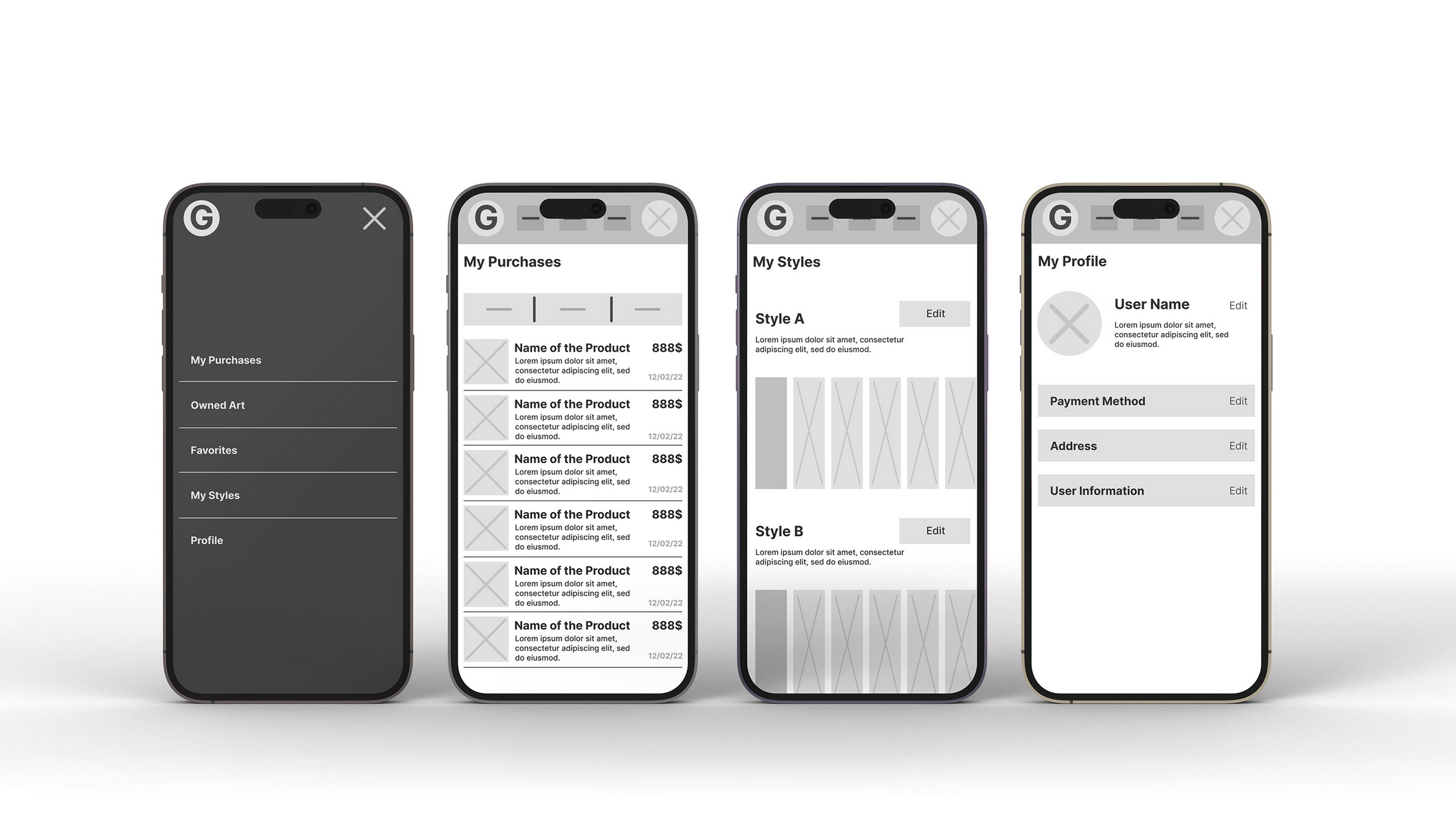
Low-Fidelity Prototype
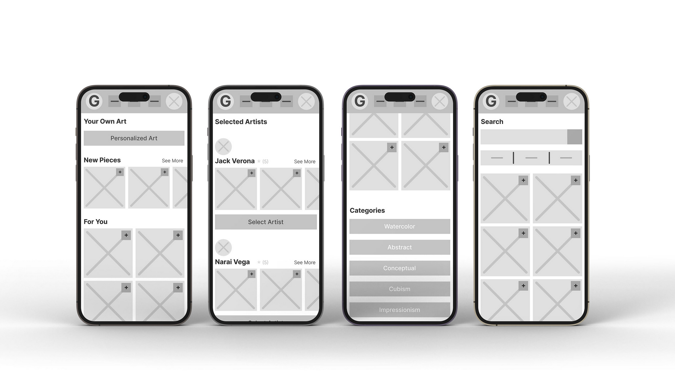
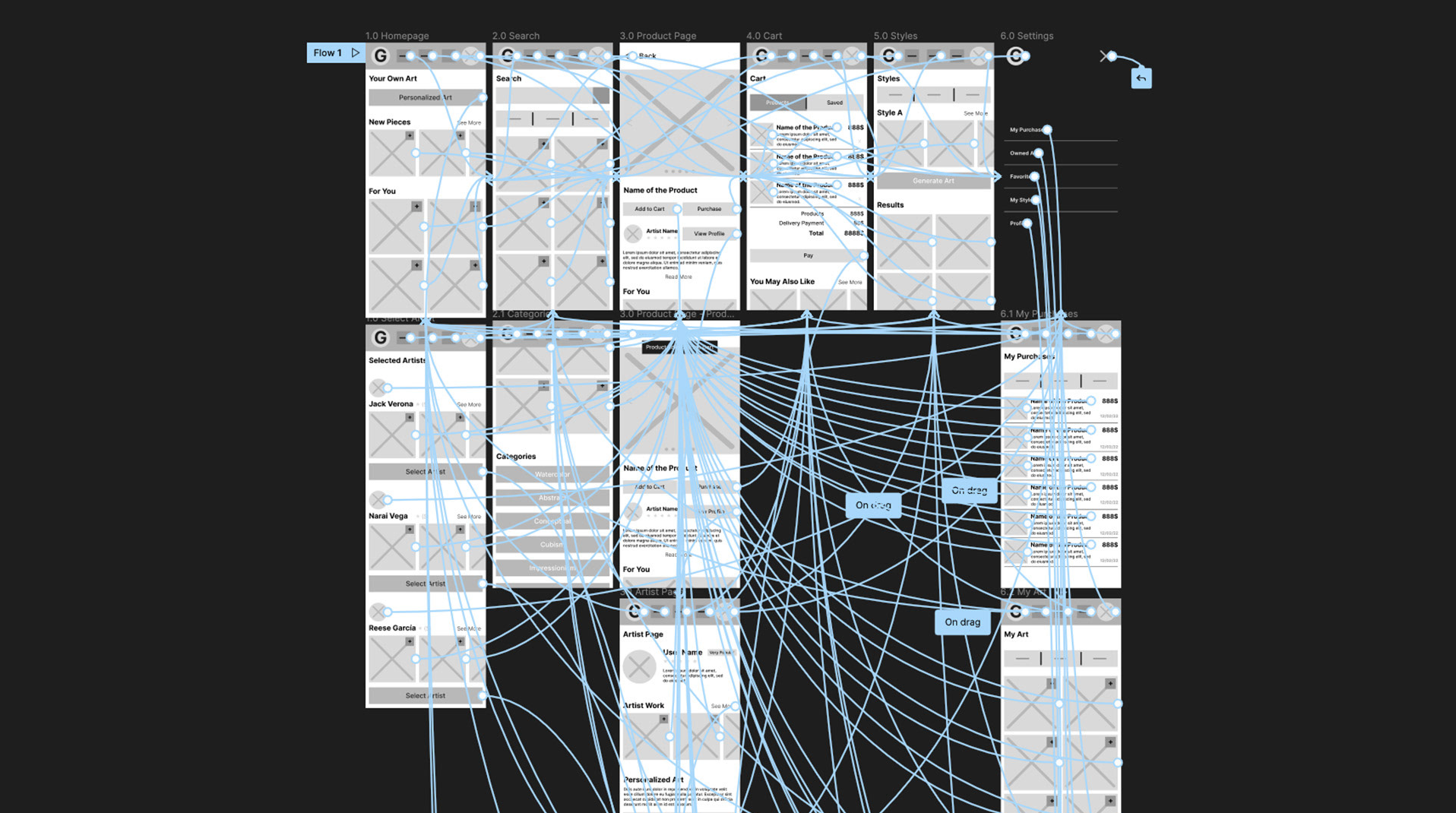
The user flow is dedicated to the main task: order personalized art easily. But there are some smaller side tasks.
Usability Study Findings
I conducted the usability study with 6 different participants: 3 women and 3 men, form age of 30 to 58. One of the participants has visual impairments.
Round 1 Findings
1. Personalized art option is not visible
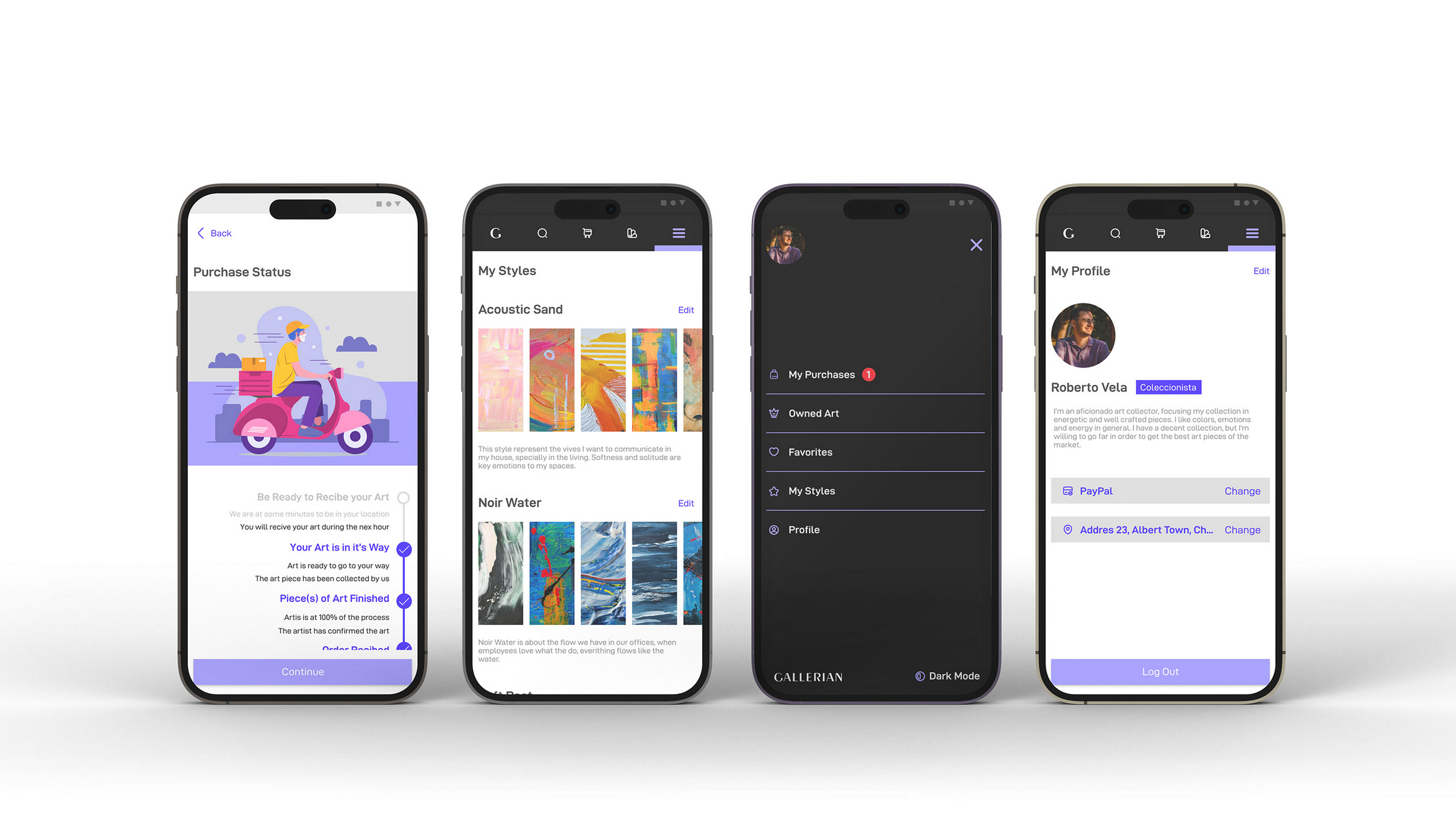
2. The status page has limited information
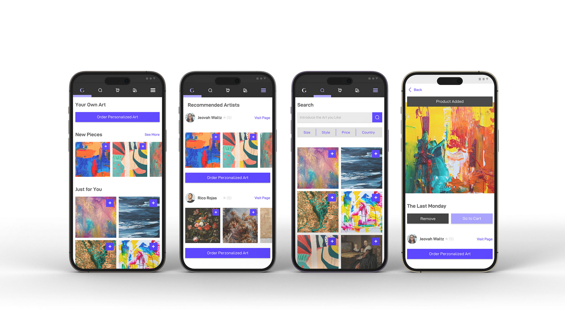
3. There is no visual clue when something is added to the cart
Round 2 Findings
1. Some button names are confusing
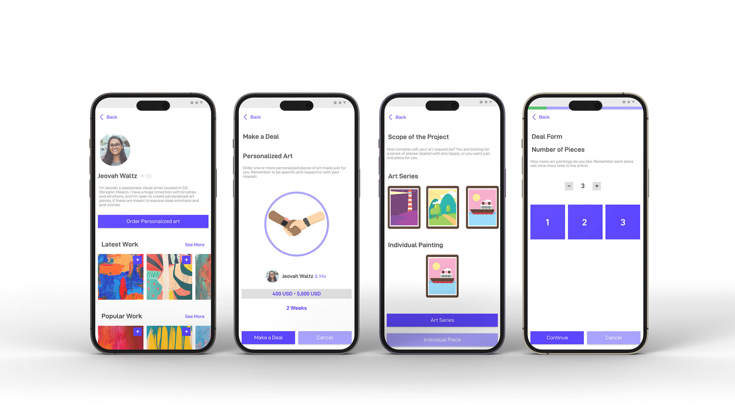
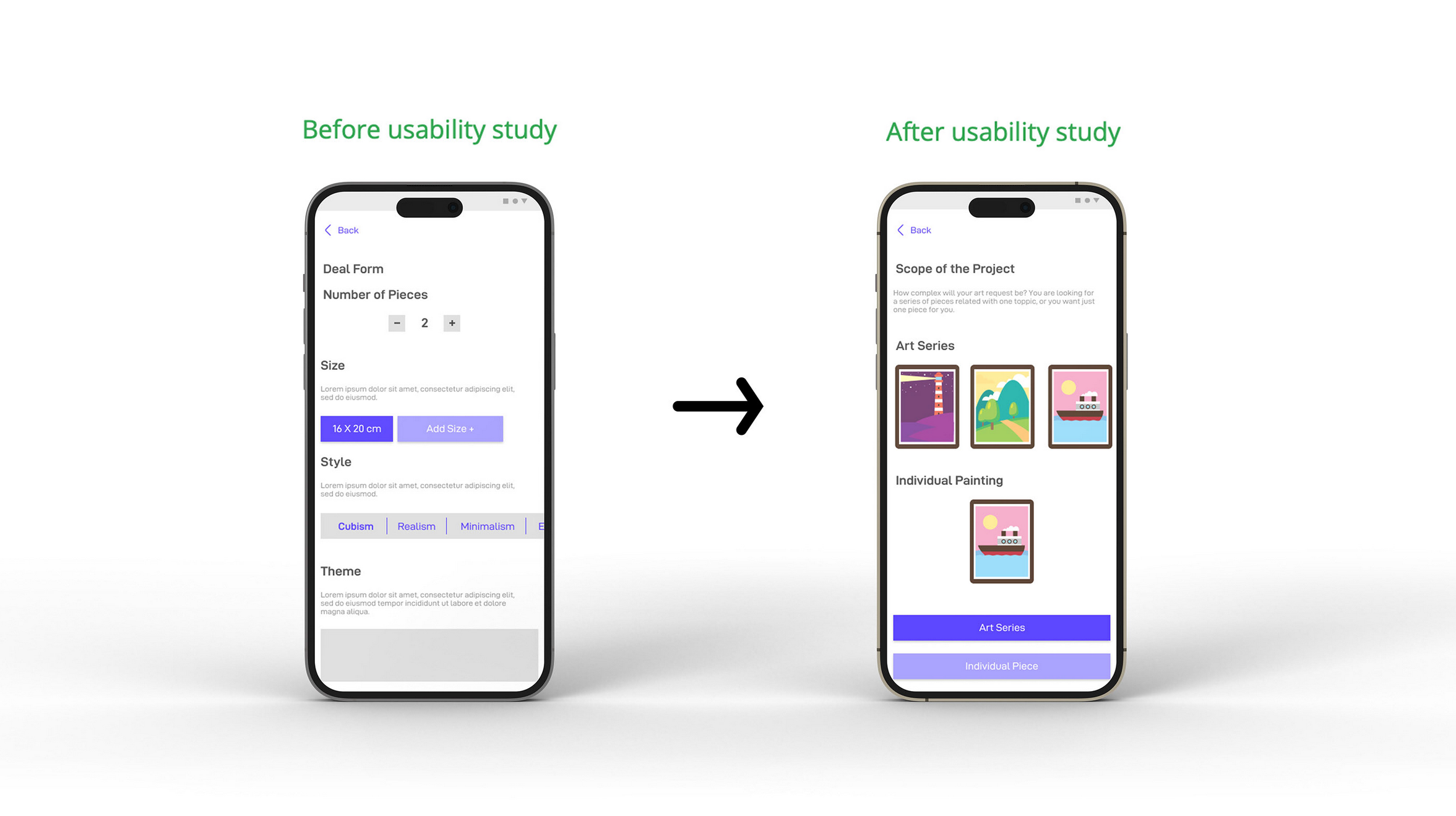
2. Deal form feels heavy
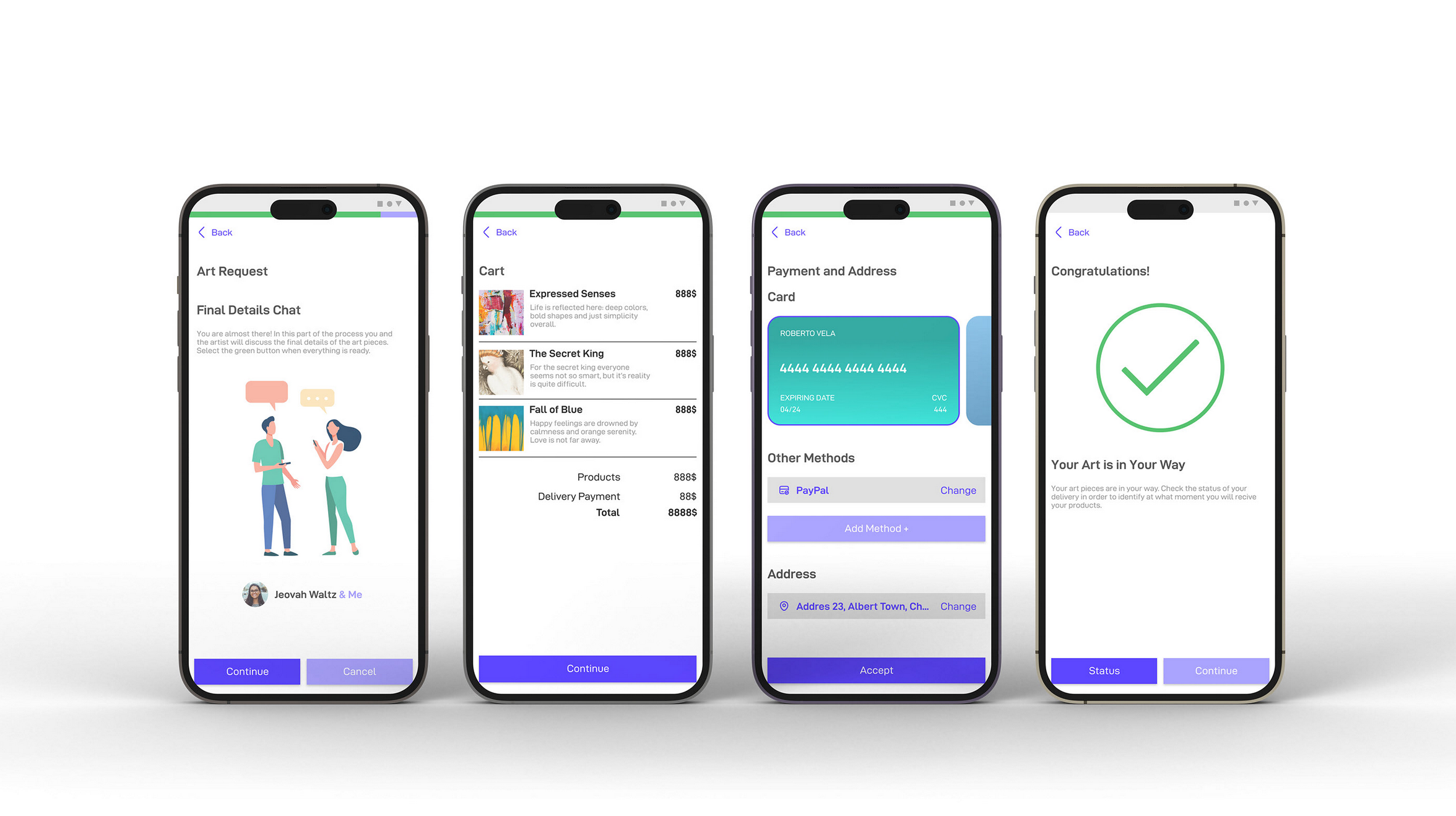
3. The checkout process is confusing
Mockups
Personalized art form changed, from a cold one screen one to a appealing multiple screens experience. Solving continuity issues and improving the experience overall.
The chat process is important, so after the study it become more automatized and simple, making the experience much better.
